알림: 이 블로그 포스트에는 제휴 링크가 삽입되어 있습니다. 자세한 내용은 이용 약관 페이지의 제휴 링크 정책을 참조하십시오.
If you’ve made your way to this blog, you’re maybe among the group of fitness entrepreneurs with Pinterest boards filled with beautiful aesthetics and inspiration for your boutique studio. Don’t worry, we’re right there with you, and when you think about it, who can blame us. The eye-catching ways some fitness studios design their spaces are swoon-worthy. We break down fitness studio designs and how your physical space plays a part in the overall goal of a seamless customer experience.
How To Build A Fitness Brand
Building a fitness brand (or any brand) is a lot of hard work, dedication, and – what we frequently say here at Ruoom – grit. There is no linear journey into building your fitness brand. Still, there are things that successful brands have executed well when it comes to creating inviting studio space for gym-goers and fitness enthusiasts. When it comes to customer experience in fitness, the basics of excellent service, knowledgeable staff and fitness instructors, a good workout, and clean facilities are all required if you’re wondering how to have a successful fitness business. But never discount the little things that keep customers wanting to come back.
For example, Barry’s Bootcamp has made a pretty seamless system for their popular strength and cardio workout. In the “Red Room,” you’ll find treadmills against the walls and benches for strength training in the middle of the room. When signing up for Barry’s class, customers can make a space reservation by choosing a numbered spot – a feature we also offer with Ruoom – on a treadmill or bench to start class, then switching between the cardio and strength equipment for the trademark Barry’s interval workout.

We use Barry’s as an excellent example for fitness center design for two reasons:
1) Fitness equipment variety
2) The requirement for customers to move between equipment multiple times
Since Barry’s is a fitness studio space and not a gym, the fitness studio design surrounds the cardio equipment, weight benches, and how to get customers moving between the equipment during sets safely, all within an hour. If you’ve ever been to Barry’s class, you’ll know they can get pretty packed, but for some reason, everyone knows (or quickly gets the hang of) what to do. Why? Optimal spacing. Sure, Barry’s could have decided to put treadmills and weight benches next to each other throughout the Red Room, but that wouldn’t have been an optimal use of floor space and likely a safety hazard.
While the Barry’s signature workout, the experienced trainers, and results are certainly the most significant reasons customers are so loyal to the brand, we can’t help but think that the brand’s studio design plays a part in why customers come back again and again. The aesthetics, the room layout, the ability to make a space reservation on a treadmill or weight bench. These seemingly small details among the greater goal of getting a good workout play a massive part in why a customer would go to Barry’s vs. doing an interval workout at a community gym.
Why is Design Important for Your Customer Experience?
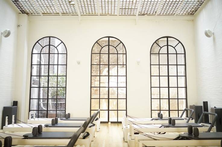
Let’s use this photo of a pilates studio design:

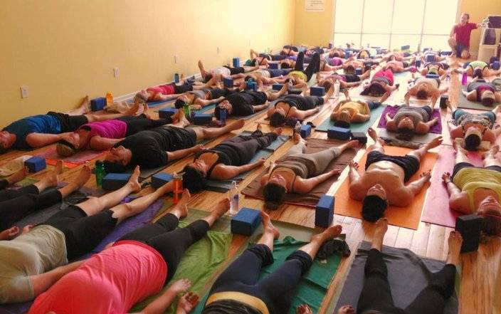
Marketing photography aside, this space looks pretty inviting, right? (those windows sure do help) Well, if you own or manage this pilates business, you suddenly got your first touchpoint with a customer. As we saw from the Barry’s example, the importance of thoughtful design reflects your brand. As a result, your customers will begin to associate specific elements that directly correlate to their positive or negative experiences. For example, let’s take a yoga class, but you’re the yoga student in this example. Have you ever been to a yoga class where there are barely 3 inches between your yoga mat and your neighbor, and a forward fold feels a little too close for comfort? At Ruoom, we’ve heard countless stories like this, and with the long-lasting effects of the pandemic, being that close to someone while sweating isn’t what a vast majority of people are looking to do when stepping back into a studio space. What was once normal and tolerable might not fulfill the best customer experience going forward.

When considering optimal spacing for your yoga studio design (or pilates studio design, spin studio, etc.), you can use our tool RoomO™. RoomO™ is our patent-pending room layout planner algorithm that will automatically create a digital floor plan and ensure social distancing for customer safety for in-person services. Using just three input parameters: room size (length and width), customer space – like yoga mat size, for example, and distance you’d like between customers, the tool automatically generates the placement of your customers and how many customers should be in your space based on your requirements.
In addition, the RoomO™ comes loaded with a database of over 1600+ fitness equipment details where a user can filter by type, brand, and name.
Aside from supporting your overall business floor plan design, you can use the RoomO™ floor plan for customer reservations. For example, suppose your business incorporates, or plans to incorporate, the ability to reserve a spot or make a space reservation the way you would book a seat on a plane. In that case, customers can view your business floor plan, choose their spot, and process payment.
Though a new concept, we believe our tool and our products will help change the way service-based businesses rethink their customer experience. We are also quite confident that the trend of space reservation – similar to what Barry’s has been doing for years – will gain more and more traction, especially as habits and safety standards of the pandemic remain strong.
Design is in The Details
While most of this blog focuses on the more significant aspects of fitness studio design, failing to mention the importance of the tiny details would be foolish. You may be amazed at how the addition of free hair ties, menstrual products, hair spray, and face wash can lead to customer satisfaction. If you know of fitness studios with these small touches in their changing areas, scan their Yelp or ClassPass reviews. You’re bound to see a handful of customers comment on these details, not the actual fitness class. Whether for better or for worse, your customers are paying attention to these types of details, and it’s best to stay a step ahead. If you have it in your operations budget to vamp up your bathroom and changing area with free products, try it out and see what works and what doesn’t. Trying to reduce costs but want to try one thing this week? Try a clean scented candle. With scent as the strongest tie to memory, you’re on the right track to ensuring your customers remember their time at your studio space.
Final Thoughts
Whether you use our tool or not (by the way, it’s free), design and the small touches you put into your fitness business play a huge part in customer experience directly correlates to customer retention. When deciding on areas to improve your fitness studio space, look for low-cost ways to enhance your space, focus on the details and put yourself in the customer’s shoes. If it’s something you’d love to have in your own fitness experience, your customers would likely love it too. Stay true to your brand; however, don’t be afraid of change if you feel it’s the best decision for your business.
Read More:
